A restaurant is more than just a place to eat; it’s an experience, a concept, a story. And at the heart of that story, beyond the tantalizing aromas and the clinking of cutlery, lies the menu. Far from a simple list of dishes and prices, the menu is a tangible manifestation of a restaurant’s identity, a silent ambassador that communicates its values, style, and culinary philosophy. The way a menu is designed, from its tactile feel to its linguistic nuances, plays a pivotal role in reinforcing the restaurant’s brand and shaping the customer’s perception long before the first bite is taken.
The Menu as a Brand Touchpoint: Beyond the Plate
Every interaction a customer has with a restaurant contributes to their overall perception of the brand. The signage, the décor, the staff’s attire, the music – all are carefully curated elements that build a cohesive identity. The menu, however, holds a unique power. It is often the first prolonged point of engagement customers have with the specifics of the dining experience. It’s where anticipation builds, decisions are made, and the brand’s promise is laid bare.
Consider a Michelin-starred fine dining establishment versus a bustling roadside diner. The menu from the former might be a beautifully bound, leather-clad tome with minimal, elegant typography and evocative dish names. The latter, on the other hand, might feature a laminated, brightly colored sheet with bold, easy-to-read fonts and straightforward descriptions. Both are effective for their respective brands, precisely because their menu design aligns seamlessly with their overall identity. This intrinsic link between menu and brand is not accidental; it’s the result of deliberate strategic choices.
The Aesthetics of Identity: Color, Typography, and Imagery
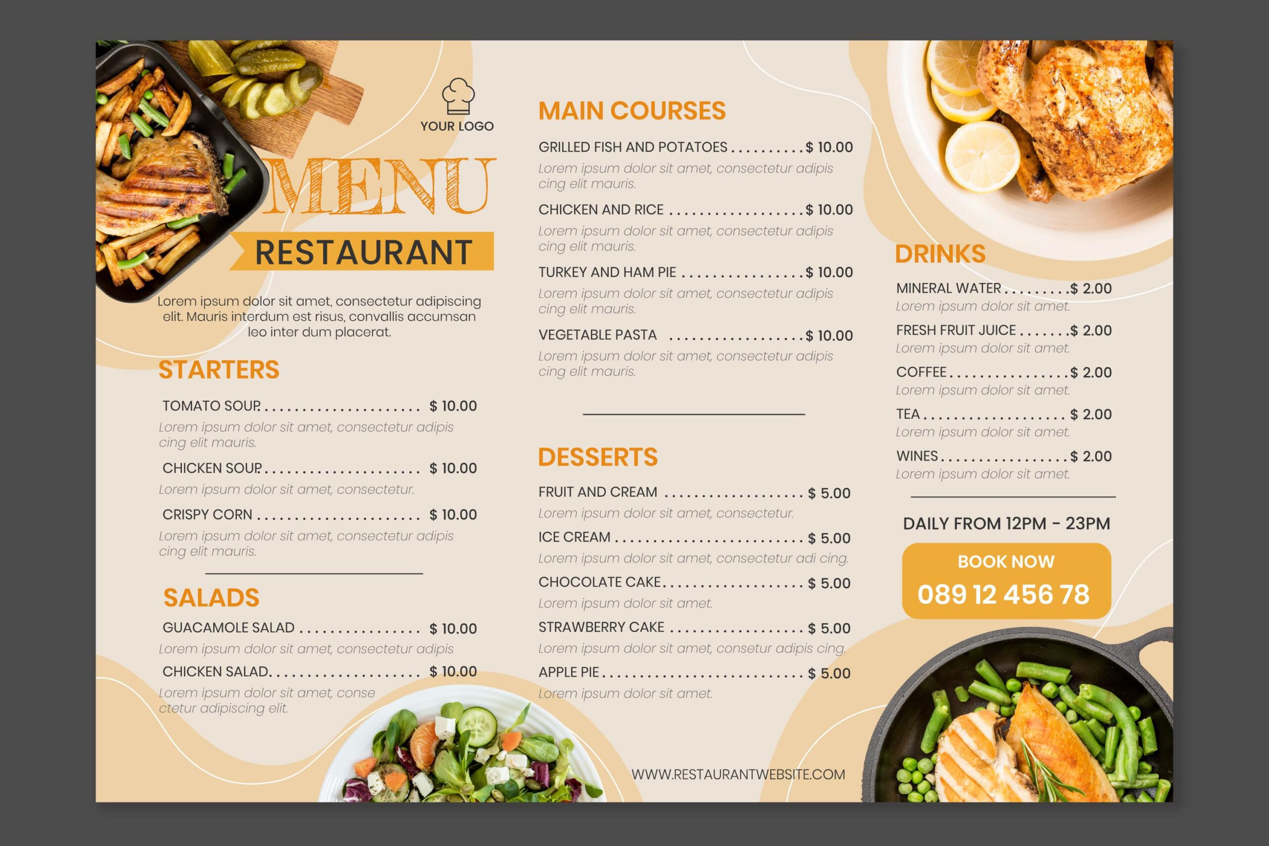
The visual elements of a menu are potent carriers of brand identity. Color schemes, for instance, are deeply intertwined with brand personality. A restaurant specializing in fresh, organic cuisine might opt for earthy tones, vibrant greens, and natural textures to evoke a sense of health and sustainability. A trendy, urban eatery might lean towards bold, contrasting colors and minimalist design to project a modern, edgy image. A cozy, rustic bistro could employ warm reds, deep browns, and hand-drawn illustrations to convey comfort and tradition. The colors chosen for the menu should echo the overall color palette of the restaurant’s interior, creating a harmonious and consistent visual experience.
Typography is another critical element. Fonts have distinct personalities. A handwritten-style font might suggest a personal, artisanal touch, perfect for a quaint bakery or a farm-to-table restaurant. A sleek, sans-serif font conveys modernity and sophistication, suitable for a contemporary lounge or a high-end sushi bar.5 Serif fonts often evoke a sense of tradition, elegance, and trustworthiness, making them ideal for classic steakhouses or established fine dining establishments.6 The font choice on the menu should be consistent with other branded materials, such as the restaurant’s logo, website, and social media presence, ensuring a unified brand voice.

The use of imagery on a menu is a nuanced decision that significantly impacts brand perception. For some brands, particularly those emphasizing fresh ingredients or visually stunning dishes, high-quality, professional photography can be a powerful tool. A vibrant photo of a perfectly plated dish can heighten desire and convey the restaurant’s commitment to culinary artistry. However, for other brands, particularly those focused on elegance, understatement, or a sense of discovery, imagery might be minimal or entirely absent. Overly saturated, generic stock photos can cheapen a brand’s image, while no photos at all might be a deliberate choice to let the descriptions and the restaurant’s reputation speak for themselves. The decision to include or exclude imagery, and the style of any images used, must align with the brand’s core values and aesthetic.
Materiality and Tactility: The Menu as a Physical Extension of Brand
Beyond the purely visual, the physical attributes of the menu itself contribute significantly to brand perception.7 The choice of material, its weight, texture, and how it feels in the hand, all communicate subtle messages about the restaurant’s quality and attention to detail.
A menu crafted from heavy, recycled paper might signal an eco-conscious and sustainable brand. A smooth, laminated menu could convey efficiency and hygiene, often seen in high-volume casual dining. A menu bound in genuine leather or a luxurious textile speaks volumes about exclusivity and premium quality, aligning with high-end dining experiences.8 Even the size and shape of the menu contribute to its brand identity. A compact, minimalist menu might reflect a concise, focused culinary offering, while an expansive, multi-page menu could suggest a vast array of choices and a more eclectic brand.
The wear and tear of a menu also reflect on the brand. A crisp, clean menu suggests a meticulous establishment that values presentation and cleanliness. A dog-eared, stained menu, conversely, can undermine even the most carefully curated brand identity, implying a lack of attention to detail and perhaps even hygiene. Regular cleaning, replacement, and maintenance of menus are therefore not just operational necessities but crucial acts of brand reinforcement.
Language and Tone of Voice: Speaking Your Brand’s Story
The words used on a menu are perhaps the most direct way to communicate a restaurant’s brand identity. The tone of voice – whether it’s playful, sophisticated, straightforward, or evocative – should be consistent with the overall brand personality.
A family-friendly restaurant might use warm, inviting language and simple, clear descriptions. A trendy, experimental eatery might employ whimsical or adventurous adjectives, hinting at unexpected flavor combinations. A classic French bistro would likely use elegant, precise terminology, often retaining traditional French dish names to reinforce its authenticity.
Beyond individual dish descriptions, the introductory and concluding remarks on the menu can further solidify brand identity. A brief history of the restaurant, a statement about its culinary philosophy, or a dedication to local ingredients can deepen the customer’s connection to the brand. Even the names given to different sections of the menu (e.g., “Starters” vs. “Overture,” or “Sweet Endings” vs. “Desserts”) contribute to the overall tone and brand narrative. This careful crafting of language ensures that the menu speaks with a consistent and recognizable brand voice.
Structure and Flow: Reflecting Culinary Philosophy
The organization and flow of a restaurant menu design also reveal aspects of its brand identity and culinary philosophy. A meticulously organized menu with clearly defined categories and a logical progression of courses suggests precision and a structured dining experience. This might be characteristic of a fine dining establishment or a restaurant with a set tasting menu.
Conversely, a more fluid or unconventional menu structure, perhaps with sections based on sharing plates or an emphasis on small bites, reflects a more relaxed, communal, or innovative dining concept. The order in which dishes are presented, the prominence given to certain categories (e.g., a strong emphasis on vegetarian options for a plant-based restaurant), and the balance between signature dishes and seasonal offerings all contribute to the brand’s narrative about its culinary approach.
For instance, a restaurant that prides itself on locally sourced, seasonal ingredients might feature a daily or weekly changing menu, emphasizing freshness and a connection to the community. This flexibility in its menu structure reinforces its brand commitment to seasonality and localism.
Reinforcing the Value Proposition: Price and Perception
While price is a practical consideration, its presentation on the menu plays a significant role in reinforcing the restaurant’s value proposition and brand positioning. A high-end restaurant will typically present prices discreetly, perhaps without currency symbols, to de-emphasize the monetary aspect and focus on the inherent value and experience. The clean, uncluttered presentation of prices aligns with a brand that offers luxury and exclusivity.
On the other hand, a budget-friendly or family-style restaurant might feature prices more prominently, even using larger fonts, to communicate affordability and value. The transparency in pricing aligns with a brand that caters to a wider audience and emphasizes accessibility. The spacing and visual hierarchy around prices also subtly influence perception; well-spaced, clearly legible prices contribute to an organized and trustworthy brand image.
Conclusion: The Menu as a Living Brand Statement
In the competitive culinary landscape, a restaurant’s brand identity is its cornerstone. The menu, often overlooked as a mere list, is in fact one of the most powerful tools for reinforcing that identity.11 From the moment a customer touches its cover to the final decision of what to order, every design element – color, typography, imagery, material, language, and structure – works in concert to communicate the restaurant’s unique story and culinary promise. By meticulously crafting their menus, restaurateurs don’t just present food; they articulate their brand, enhance the customer experience, and cultivate a lasting impression that resonates far beyond the dining table.12 The menu is not just in the restaurant; it is the restaurant, in miniature, a living statement of its brand.